A New Year and a new graph of the day! This graphic actually uses a new Python library, wbdata, for grabbing World Bank data via the World Bank's API. Here is a plot of global inflation over the last 50 odd years for all available countries. I have color-coded the countries according to income group: Low, Lower-Middle, Upper-Middle, or High.
I am not entirely thrilled with this graph. It turned out to be hard to scale the y-axis to capture the full range of the data: Democratic Republic of Congo had an annual inflation rate over 23,000% in 1994! Zimbabwe would have had even higher annual inflation rates but they stopped reporting inflation statistics in 2006 (just prior to the onset of its recent bought of hyperinflation).
As always, code is available on GitHub.
Blog Topics...
3D plotting
(1)
Academic Life
(2)
ACE
(18)
Adaptive Behavior
(2)
Agglomeration
(1)
Aggregation Problems
(1)
Asset Pricing
(1)
Asymmetric Information
(2)
Behavioral Economics
(1)
Breakfast
(4)
Business Cycles
(8)
Business Theory
(4)
China
(1)
Cities
(2)
Clustering
(1)
Collective Intelligence
(1)
Community Structure
(1)
Complex Systems
(42)
Computational Complexity
(1)
Consumption
(1)
Contracting
(1)
Credit constraints
(1)
Credit Cycles
(6)
Daydreaming
(2)
Decision Making
(1)
Deflation
(1)
Diffusion
(2)
Disequilibrium Dynamics
(6)
DSGE
(3)
Dynamic Programming
(6)
Dynamical Systems
(9)
Econometrics
(2)
Economic Growth
(5)
Economic Policy
(5)
Economic Theory
(1)
Education
(4)
Emacs
(1)
Ergodic Theory
(6)
Euro Zone
(1)
Evolutionary Biology
(1)
EVT
(1)
Externalities
(1)
Finance
(29)
Fitness
(6)
Game Theory
(3)
General Equilibrium
(8)
Geopolitics
(1)
GitHub
(1)
Graph of the Day
(11)
Greatest Hits
(1)
Healthcare Economics
(1)
Heterogenous Agent Models
(2)
Heteroskedasticity
(1)
HFT
(1)
Housing Market
(2)
Income Inequality
(2)
Inflation
(2)
Institutions
(2)
Interesting reading material
(2)
IPython
(1)
IS-LM
(1)
Jerusalem
(7)
Keynes
(1)
Kronecker Graphs
(3)
Krussel-Smith
(1)
Labor Economics
(1)
Leverage
(2)
Liquidity
(11)
Logistics
(6)
Lucas Critique
(2)
Machine Learning
(2)
Macroeconomics
(45)
Macroprudential Regulation
(1)
Mathematics
(23)
matplotlib
(10)
Mayavi
(1)
Micro-foundations
(10)
Microeconomic of Banking
(1)
Modeling
(8)
Monetary Policy
(4)
Mountaineering
(9)
MSD
(1)
My Daily Show
(3)
NASA
(1)
Networks
(46)
Non-parametric Estimation
(5)
NumPy
(2)
Old Jaffa
(9)
Online Gaming
(1)
Optimal Growth
(1)
Oxford
(4)
Pakistan
(1)
Pandas
(8)
Penn World Tables
(1)
Physics
(2)
Pigouvian taxes
(1)
Politics
(6)
Power Laws
(10)
Prediction Markets
(1)
Prices
(3)
Prisoner's Dilemma
(2)
Producer Theory
(2)
Python
(29)
Quant
(4)
Quote of the Day
(21)
Ramsey model
(1)
Rational Expectations
(1)
RBC Models
(2)
Research Agenda
(36)
Santa Fe
(6)
SciPy
(1)
Shakshuka
(1)
Shiller
(1)
Social Dynamics
(1)
St. Andrews
(1)
Statistics
(1)
Stocks
(2)
Sugarscape
(2)
Summer Plans
(2)
Systemic Risk
(13)
Teaching
(16)
Theory of the Firm
(4)
Trade
(4)
Travel
(3)
Unemployment
(9)
Value iteration
(2)
Visualizations
(1)
wbdata
(2)
Web 2.0
(1)
Yale
(1)
Showing posts with label Inflation. Show all posts
Tuesday, January 1, 2013
Friday, December 28, 2012
Graph of the Day
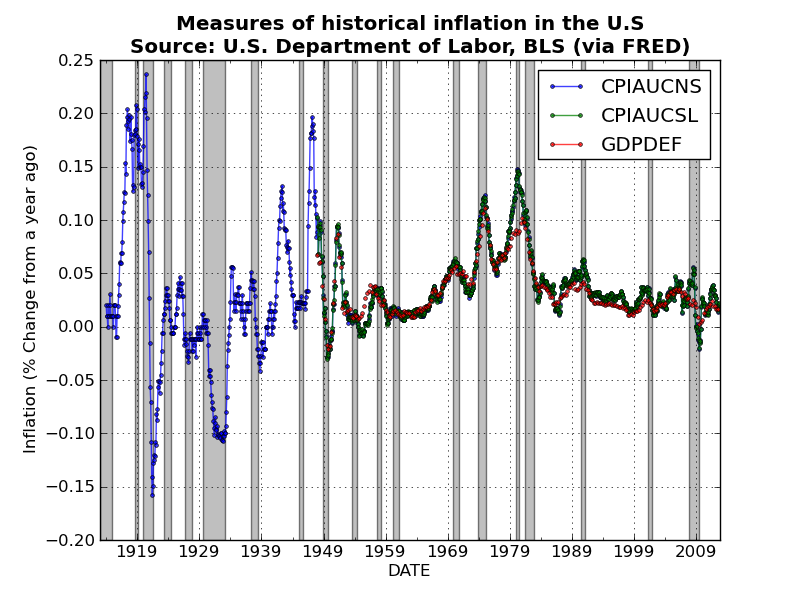
Took a few days off blogging for Christmas and Boxing Day, but am now back at it! Here is a quick plot of historical measures of inflation in the U.S.. I used Pandas to grab the three price indices, and then used a nice built-in Pandas method pct_change(periods)to convert the monthly price indices (i.e., CPIAUCNS and CPIAUCSL) and the quarterly GDP deflator to measures of percentage change in prices from a year ago (which is a standard measure of inflation).
After combining the three series into a single DataFrame object, you can plot all three series with a single line of code!
Unsurprisingly the three measures track one another very closely. Perhaps I should have thrown in some measures of producer prices? Code is available here.
After combining the three series into a single DataFrame object, you can plot all three series with a single line of code!
Unsurprisingly the three measures track one another very closely. Perhaps I should have thrown in some measures of producer prices? Code is available here.
Labels:
Graph of the Day,
Inflation,
Macroeconomics,
matplotlib,
Pandas,
Python
Subscribe to:
Posts (Atom)