I recently wrote some Python code to compute paths of technology and the implied Solow residuals using data from the Penn World Tables. Combining the results with some country metadata (i.e., income groupings) from the World Bank API yields this pretty interesting graphic...
If you don't already have the Penn World Tables data...no worries! The script will download the PWT data, compute the Solow residuals based on a method used by Hall and Jones (1999). Based on this decomposition, high income (i.e., red) countries had higher levels of technology in 1960 and higher subsequent growth rates of technology. In fact, the low income (i.e., purple) countries have had effectively zero technological progress since 1960!
Enjoy!
Blog Topics...
3D plotting
(1)
Academic Life
(2)
ACE
(18)
Adaptive Behavior
(2)
Agglomeration
(1)
Aggregation Problems
(1)
Asset Pricing
(1)
Asymmetric Information
(2)
Behavioral Economics
(1)
Breakfast
(4)
Business Cycles
(8)
Business Theory
(4)
China
(1)
Cities
(2)
Clustering
(1)
Collective Intelligence
(1)
Community Structure
(1)
Complex Systems
(42)
Computational Complexity
(1)
Consumption
(1)
Contracting
(1)
Credit constraints
(1)
Credit Cycles
(6)
Daydreaming
(2)
Decision Making
(1)
Deflation
(1)
Diffusion
(2)
Disequilibrium Dynamics
(6)
DSGE
(3)
Dynamic Programming
(6)
Dynamical Systems
(9)
Econometrics
(2)
Economic Growth
(5)
Economic Policy
(5)
Economic Theory
(1)
Education
(4)
Emacs
(1)
Ergodic Theory
(6)
Euro Zone
(1)
Evolutionary Biology
(1)
EVT
(1)
Externalities
(1)
Finance
(29)
Fitness
(6)
Game Theory
(3)
General Equilibrium
(8)
Geopolitics
(1)
GitHub
(1)
Graph of the Day
(11)
Greatest Hits
(1)
Healthcare Economics
(1)
Heterogenous Agent Models
(2)
Heteroskedasticity
(1)
HFT
(1)
Housing Market
(2)
Income Inequality
(2)
Inflation
(2)
Institutions
(2)
Interesting reading material
(2)
IPython
(1)
IS-LM
(1)
Jerusalem
(7)
Keynes
(1)
Kronecker Graphs
(3)
Krussel-Smith
(1)
Labor Economics
(1)
Leverage
(2)
Liquidity
(11)
Logistics
(6)
Lucas Critique
(2)
Machine Learning
(2)
Macroeconomics
(45)
Macroprudential Regulation
(1)
Mathematics
(23)
matplotlib
(10)
Mayavi
(1)
Micro-foundations
(10)
Microeconomic of Banking
(1)
Modeling
(8)
Monetary Policy
(4)
Mountaineering
(9)
MSD
(1)
My Daily Show
(3)
NASA
(1)
Networks
(46)
Non-parametric Estimation
(5)
NumPy
(2)
Old Jaffa
(9)
Online Gaming
(1)
Optimal Growth
(1)
Oxford
(4)
Pakistan
(1)
Pandas
(8)
Penn World Tables
(1)
Physics
(2)
Pigouvian taxes
(1)
Politics
(6)
Power Laws
(10)
Prediction Markets
(1)
Prices
(3)
Prisoner's Dilemma
(2)
Producer Theory
(2)
Python
(29)
Quant
(4)
Quote of the Day
(21)
Ramsey model
(1)
Rational Expectations
(1)
RBC Models
(2)
Research Agenda
(36)
Santa Fe
(6)
SciPy
(1)
Shakshuka
(1)
Shiller
(1)
Social Dynamics
(1)
St. Andrews
(1)
Statistics
(1)
Stocks
(2)
Sugarscape
(2)
Summer Plans
(2)
Systemic Risk
(13)
Teaching
(16)
Theory of the Firm
(4)
Trade
(4)
Travel
(3)
Unemployment
(9)
Value iteration
(2)
Visualizations
(1)
wbdata
(2)
Web 2.0
(1)
Yale
(1)
Showing posts with label matplotlib. Show all posts
Saturday, January 26, 2013
Thursday, January 17, 2013
Python code to grab Penn World Tables data
For any interested parties, I wrote a small python script to download the Penn World Tables dataset and convert it into a Pandas Panel. Code passed all of my tests, but can't claim that it is industrial strength.
To test out the code, I put together a quick set of layered histograms for global real GDP per capita growth rates from 1951 to 2010. Result...
The number of countries for which data is available varies from around 50 in 1951 to roughly 190 in 2010. Perhaps this means I should have normalized the above histogram?
To test out the code, I put together a quick set of layered histograms for global real GDP per capita growth rates from 1951 to 2010. Result...
The number of countries for which data is available varies from around 50 in 1951 to roughly 190 in 2010. Perhaps this means I should have normalized the above histogram?
Thursday, January 3, 2013
How well do you know your utility function?
This is an excerpt from my teaching notes for an upcoming computational economics lab on the RBC model that I am teaching at the University of Edinburgh that I thought might be of more general interest (mostly because of the cool graphics!)...
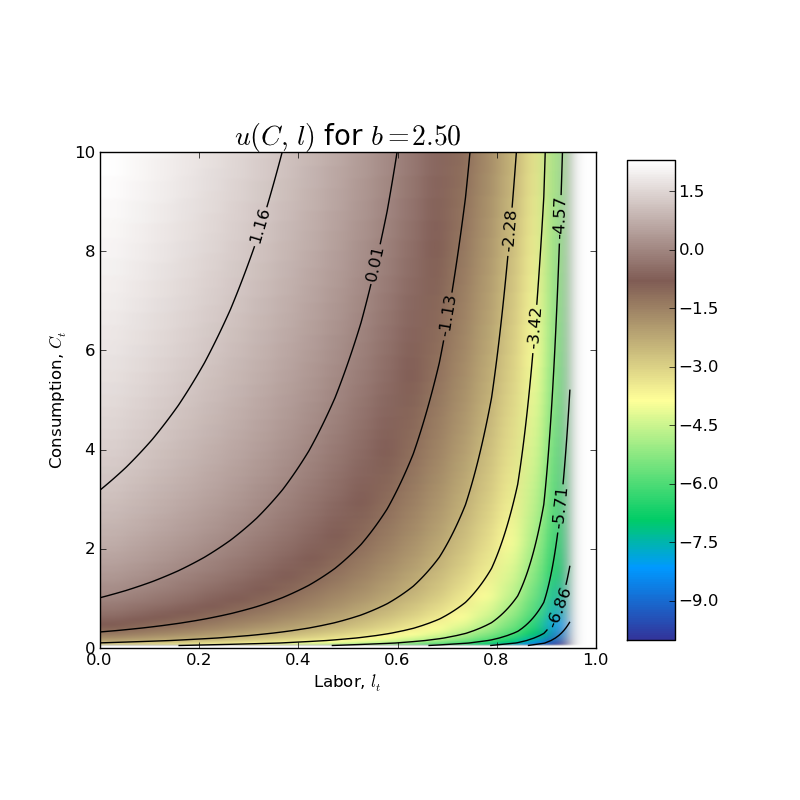
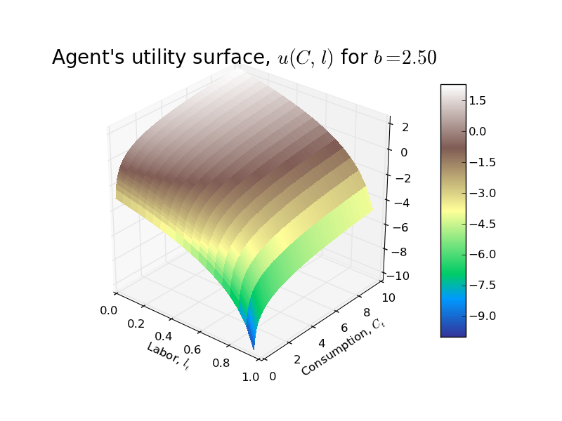
In the basic RBC model from Chapter 5 of David Romer's Advanced Macroeconomics, the representative household has the following single period utility function: $$u(C_{t}, l_{t}) = ln(C_{t}) + b\ ln(1 - l_{t})$$ where $C_{t}$ is per capita consumption, $l_{t}$ is labor (note that labor endowment has been normalized to 1!), and $b$ is a parameter (just a weight that the household places on utility from leisure relative to utility from consumption).
First a 3D plot of the utility surface...
Followed by a nice contour plot showing the indifference curves for the agent...
Suppose that the representative household lives for two periods and that there is no uncertainty about future prices. Because of logarithmic preferences, the household will follow the decision rule 'consume a fraction fixed fraction of the PDV of lifetime net worth.' We can derive this decision rule formally as follows. First, note that the household budget constraint is $$C_{0} + \frac{1}{1 + r_{1}}C_{1} = w_{0}l_{0} + \frac{1}{1 + r_{1}}w_{1}l_{1}$$ where $r_{1}$ is the real interest rate. The Lagrangian for the household's two period optimization problem is $$\max_{\{C_{t}\}, \{l_{t}\}} ln(C_{0}) + b\ ln(1-l_{0}) + \beta[ln(C_{1}) + b\ ln(1-l_{1})] + \lambda\left[w_{0}l_{0} + \frac{1}{1 + r_{1}}w_{1}l_{1} - C_{0} - \frac{1}{1 + r_{1}}C_{1}\right]$$ The household now chooses sequences of consumption and labor (i.e., representative household chooses $C_{0}, C_{1}, l_{0}, l_{1}$). The FOC along with the budget constraint imply a system of 5 equations in the 5 unknowns $C_{0}, C_{1}, l_{0}, l_{1}, \lambda$ as follows: $$\begin{align}\frac{1}{C_{0}} - \lambda =& 0 \\ \beta\frac{1}{C_{1}} - \lambda \frac{1}{1+r_{1}}=& 0 \\-\frac{b}{1 - l_{0}} + \lambda w_{0} =& 0 \\-\beta\frac{b}{1 - l_{1}} + \lambda \frac{1}{1 + r_{1}}w_{1} =& 0 \\C_{0} + \frac{1}{1 + r_{1}}C_{1} =& w_{0}l_{0} + \frac{1}{1 + r_{1}}w_{1}l_{1}\end{align}$$ This 5 equation system can be reduced (by eliminating the Lagrange multiplier $\lambda$) to a linear system of 4 equations in 4 unknowns: $$\begin{vmatrix} b & \ 0 & \ w_{0} & 0 \\\ \beta(1 + r_{1}) & -1 & 0 & 0 \\\ 0 & \ b & 0 & w_{1} \\\ 1 & \frac{1}{1 + r_{1}} & -w_{0} & -\frac{1}{1+r_{1}}w_{1} \end{vmatrix} \begin{vmatrix}C_{0} \\\ C_{1} \\\ l_{0} \\\ l_{1}\end{vmatrix} = \begin{vmatrix} w_{0} \\\ 0 \\\ w_{1} \\\ 0\end{vmatrix}$$ The above system can be solved in closde form using some method like Cramer's rule/substitution etc to yield the following optimal sequences/policies for consumption and labor supply: $$\begin{align}C_{0} =& \frac{1}{(1 + b)(1 + \beta)}\left(w_{0} + \frac{1}{1 + r_{1}}w_{1}\right) \\ C_{1} =& \left(\frac{1 + r_{1}}{1 + b}\right)\left(\frac{\beta}{1 + \beta}\right)\left(w_{0} + \frac{1}{1 + r_{1}}w_{1}\right) \\ l_{0} =& 1 - \left(\frac{b}{w_{0}}\right)\left(\frac{1}{(1 + b)(1 + \beta)}\right)\left(w_{0} + \frac{1}{1 + r_{1}}w_{1}\right) \\ l_{1} =& 1 - \left(\frac{b\beta(1+r_{1})}{w_{1}}\right) \left(\frac{1}{(1 + b)(1 + \beta)}\right)\left(w_{0} + \frac{1}{1 + r_{1}}w_{1}\right) \end{align}$$
Several important points to note about the above optimal consumption and labor supply policies:
- Household's lifetime net worth, $w_{0} + \frac{1}{1 + r_{1}}w_{1}$, is the present discounted value of its labor endowment.
- Household's lifetime net worth depends on the wages in BOTH periods and future interest rate. It hints at the more general result that, if the household has an infinite time horizon, lifetime net worth depends on the entire future path of wages and interest rates.
- In each period, household's consume a fraction of their lifetime net worth. Although the fraction changes in this simple two period model, if the household has an infinite horizon, the fraction of lifetime net worth consumed each period will be fixed and equal to $$\frac{1}{(1 + b)(1 + \beta + \beta^2 + \dots)}=\frac{1 - \beta}{1 + b}$$
- From the policy function for $l_{0}$, one can show that in order for the labor supply in period $t=0$ to be non-negative (which it must!), the following inequality must hold: $$\left(\frac{1}{1 + r_{1}}\right)\left(\frac{w_{1}}{w_{0}}\right) \lt \frac{(1 + b)(1 + \beta)}{b} - 1$$
- From the policy function for $l_{1}$, in order for the labor supply in period $t=1$ to be non-negative (which it must!), the following inequality must hold: $$(1 + r_{1})\left(\frac{w_{0}}{w_{1}}\right) \lt \left(\frac{1 + b}{b}\right)\left(\frac{1 + \beta}{\beta}\right) - 1$$
If we specify some prices (i.e., wages in period $t=0, 1$, $w_{0}=5,w_{1}=9$ and the interest rate $r_{1}=0.025$), then we can graphically represent the optimal choices of consumption and labor supply in period $t=0$ and $t=1$ as follows.
Note that with the wage in $t=1$ being almost twice as high as the wage in period $t=0$, the agent pushes his labor supply in period $t=0$, $l_{0}$, almost all the way to zero (i.e., he chooses not to work very much). The agent can still consume because, absent any frictions (things like borrowing constraints, incomplete markets, imperfect contracts, etc), he can easily consume some of his future labor earnings in period $t=1$ in the current period.
In period $t=1$, although the higher wage causes the agent to significantly increases his labor supply, there is no much change in his level of consumption (i.e., there is consumption smoothing!).
As always, code is available on GitHub.
Labels:
Graph of the Day,
matplotlib,
NumPy,
Python,
RBC Models
Wednesday, January 2, 2013
Graph of the Day
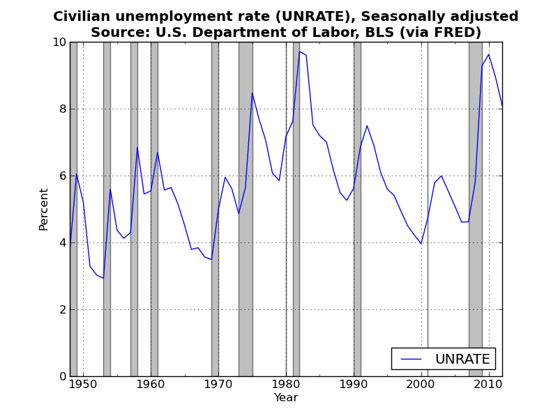
A busy day (actually trying to do a bit of my own research!)...so I just threw together a plot of the historical civilian unemployment rate using FRED data (similar to figure 1-3 from Mankiw's intermediate macroeconomics textbook). Very boring I know, but tomorrow I promise something a bit more interesting!
If anyone can point me in the direction of the actual data that Mankiw uses to generate the graphs from his textbook I would be very grateful. I can't seem to find it! Code for the above is available on GitHub.
Labels:
Graph of the Day,
Macroeconomics,
matplotlib,
Pandas,
Python,
Unemployment
Tuesday, January 1, 2013
Graph of the Day
A New Year and a new graph of the day! This graphic actually uses a new Python library, wbdata, for grabbing World Bank data via the World Bank's API. Here is a plot of global inflation over the last 50 odd years for all available countries. I have color-coded the countries according to income group: Low, Lower-Middle, Upper-Middle, or High.
I am not entirely thrilled with this graph. It turned out to be hard to scale the y-axis to capture the full range of the data: Democratic Republic of Congo had an annual inflation rate over 23,000% in 1994! Zimbabwe would have had even higher annual inflation rates but they stopped reporting inflation statistics in 2006 (just prior to the onset of its recent bought of hyperinflation).
As always, code is available on GitHub.
I am not entirely thrilled with this graph. It turned out to be hard to scale the y-axis to capture the full range of the data: Democratic Republic of Congo had an annual inflation rate over 23,000% in 1994! Zimbabwe would have had even higher annual inflation rates but they stopped reporting inflation statistics in 2006 (just prior to the onset of its recent bought of hyperinflation).
As always, code is available on GitHub.
Labels:
Graph of the Day,
Inflation,
matplotlib,
Pandas,
Python,
wbdata
Monday, December 31, 2012
Graph of the Day
Today's graphic is motivated by recent posts by Paul Krugman on implications of capital-biased technological change. In both posts Krugman uses the share of employee compensation (COE) to nominal GDP as his measure of labor's share of income. Although the data for both series go back to 1947, Krugman chooses to drop the data prior to 1973 arguing that 1973 marked the end of the post-WWII economic boom. Put another way, Krugman is saying that there is a structural break in the data generating process for labor's share which makes data prior to 1973 useless (or perhaps actively misleading) if one is interested in thinking about future trends in labor share.
If you are wondering what a plot of the entire time series looks like here is the ratio of COE / GDP from 1947 forward.
It looks like the employee compensation ratio is roughly the same today as it was in 1950 (although obviously heading in different directions!).
In his first post Krugman argues that this measure "fluctuates over the business cycle." Note that the vertical scale ranges only from 0.52 to 0.60. Such a small range will exacerbate fluctuations in the series. Plotting the same data on its natural scale (i.e., 0 to 1), yields the following.
Based on this plot, the measure appears to have been remarkably constant over the past 60 odd years.
Which of these plots gives the more "correct" view of the data? Or does it depend on the point you are trying to make?
As always, code is available.
If you are wondering what a plot of the entire time series looks like here is the ratio of COE / GDP from 1947 forward.
It looks like the employee compensation ratio is roughly the same today as it was in 1950 (although obviously heading in different directions!).
In his first post Krugman argues that this measure "fluctuates over the business cycle." Note that the vertical scale ranges only from 0.52 to 0.60. Such a small range will exacerbate fluctuations in the series. Plotting the same data on its natural scale (i.e., 0 to 1), yields the following.
Based on this plot, the measure appears to have been remarkably constant over the past 60 odd years.
Which of these plots gives the more "correct" view of the data? Or does it depend on the point you are trying to make?
As always, code is available.
Labels:
Graph of the Day,
Labor Economics,
Macroeconomics,
matplotlib,
Pandas,
Python
Friday, December 28, 2012
Graph of the Day
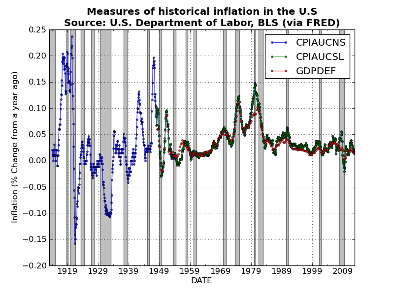
Took a few days off blogging for Christmas and Boxing Day, but am now back at it! Here is a quick plot of historical measures of inflation in the U.S.. I used Pandas to grab the three price indices, and then used a nice built-in Pandas method pct_change(periods)to convert the monthly price indices (i.e., CPIAUCNS and CPIAUCSL) and the quarterly GDP deflator to measures of percentage change in prices from a year ago (which is a standard measure of inflation).
After combining the three series into a single DataFrame object, you can plot all three series with a single line of code!
Unsurprisingly the three measures track one another very closely. Perhaps I should have thrown in some measures of producer prices? Code is available here.
After combining the three series into a single DataFrame object, you can plot all three series with a single line of code!
Unsurprisingly the three measures track one another very closely. Perhaps I should have thrown in some measures of producer prices? Code is available here.
Labels:
Graph of the Day,
Inflation,
Macroeconomics,
matplotlib,
Pandas,
Python
Monday, December 24, 2012
Graph(s) of the Day!
Today's graphic(s) attempt to dispel a common misunderstanding of basic probability theory. We all know that flipping a fair coin will result in heads exactly 50% of the time. Given this, many people seem to think that the Law of Large Numbers (LLN) tells us that the observed number of heads should more or less equal the expected number of heads. This intuition is wrong!
A South African mathematician named John Kerrich was visiting Copenhagen in 1940 when Germany invaded Denmark. Kerrich spent the next five years in an interment camp where, to pass the time, he carried out a series of experiments in probability theory...including an experiment where he flipped a coin by hand 10,000 times! He apparently also used ping-pong balls to demonstrate Bayes theorem.
After the war Kerrich was released and published the results of many of his experiments. I have copied the table of the coin flipping results reported by Kerrich below (and included a csv file on GitHub). The first two collumns are self explanatory, the third column, Difference, is the difference between the observed number of heads and the expected number of heads.
Below I plot the data in the third column: the difference between the observed number of heads and the expected number of heads is diverging (which is the exact opposite of most peoples' intuition)!
Perhaps Kerrich made a mistake (he didn't), but we can check his results via simulation! First, a single replication of T = 10,000 flips of a fair coin...
Again, we observe divergence (but this time in the opposite direction!). For good measure, I ran N=100 replications of the same experiment (i.e., flipping a coin T=10,000 times). The result is the following nice graphic...
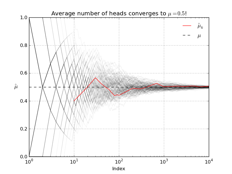
Our simulations suggest that Kerrich's result was indeed typical. The LLN does not say that as T increases the observed number of heads will be close to the expected number of heads! What the LLN says instead is that, as T increases, the average number of heads will get closer and closer to the true population average (which in this case, with our fair coin, is 0.5).
A South African mathematician named John Kerrich was visiting Copenhagen in 1940 when Germany invaded Denmark. Kerrich spent the next five years in an interment camp where, to pass the time, he carried out a series of experiments in probability theory...including an experiment where he flipped a coin by hand 10,000 times! He apparently also used ping-pong balls to demonstrate Bayes theorem.
After the war Kerrich was released and published the results of many of his experiments. I have copied the table of the coin flipping results reported by Kerrich below (and included a csv file on GitHub). The first two collumns are self explanatory, the third column, Difference, is the difference between the observed number of heads and the expected number of heads.
| Tosses | Heads | Difference |
| 10 | 4 | -1 |
| 20 | 10 | 0 |
| 30 | 17 | 2 |
| 40 | 21 | 1 |
| 50 | 25 | 0 |
| 60 | 29 | -1 |
| 70 | 32 | -3 |
| 80 | 35 | -5 |
| 90 | 40 | -5 |
| 100 | 44 | -6 |
| 200 | 98 | -2 |
| 300 | 146 | -4 |
| 400 | 199 | -1 |
| 500 | 255 | 5 |
| 600 | 312 | 12 |
| 700 | 368 | 18 |
| 800 | 413 | 13 |
| 900 | 458 | 8 |
| 1000 | 502 | 2 |
| 2000 | 1013 | 13 |
| 3000 | 1510 | 10 |
| 4000 | 2029 | 29 |
| 5000 | 2533 | 33 |
| 6000 | 3009 | 9 |
| 7000 | 3516 | 16 |
| 8000 | 4034 | 34 |
| 9000 | 4538 | 38 |
| 10000 | 5067 | 67 |
Perhaps Kerrich made a mistake (he didn't), but we can check his results via simulation! First, a single replication of T = 10,000 flips of a fair coin...
Again, we observe divergence (but this time in the opposite direction!). For good measure, I ran N=100 replications of the same experiment (i.e., flipping a coin T=10,000 times). The result is the following nice graphic...
Our simulations suggest that Kerrich's result was indeed typical. The LLN does not say that as T increases the observed number of heads will be close to the expected number of heads! What the LLN says instead is that, as T increases, the average number of heads will get closer and closer to the true population average (which in this case, with our fair coin, is 0.5).
Let's run another simulation to verify that the LLN actually holds. In the experiment I conduct N=100 runs of T=10,000 coin flips. For each of the runs I re-compute the sample average after each successive flip.
As always code and data are available! Enjoy.
Labels:
Graph of the Day,
matplotlib,
NumPy,
Pandas,
SciPy,
Statistics
Sunday, December 23, 2012
Graph of the Day
Earlier this week I used Pandas to grab some historical data on the S&P 500 from Yahoo!Finance and generate a simple time series plot. Today, I am going to re-examine this data set in order to show the importance of scaling and adjusting for inflation when plotting economic data.
I again use the functions from the pandas.io.data to grab the data. Specifically, I use get_data_yahoo('^GSPC') to get the S&P 500 time series, and get_data_fred('CPIAUCSL')to grab the consumer price index (CPI). Here is a naive plot of historical S&P 500 returns from 1950 through 2012 (as usual, includes grey NBER recession bands).
Note that, because the CPI data are monthly frequency, I resample the daily S&P 500 data by taking monthly averages. This plot might make you conclude that there was a massive structural break/regime change around the year 2000 in whatever underlying process is generating the S&P 500. However, as the level of the S&P 500 increases, the linear scale on the vertical axis makes changes from month to month seem more dramatic. To control for this, I simply make the vertical scale logarithmic (now equal distances on the vertical axis represent equal percentage changes in the S&P 500).
Now the "obvious" structural break in the year 2000 no longer seems so obvious. Indeed there was a period of roughly 10-15 years during the late 1960's through 1970's during which the S&P 500 basically moved sideways in a similar manner to what we have experienced during the last 10+ years.
This brings us to another, more significant, problem with these graphs: neither or them adjusts for inflation! When plotting long economic time series it is always a good idea to adjust for inflation. The 1970's was a period of fairly high inflation in the U.S., thus the fact that the nominal value of the S&P 500 didn't change all that much over this period tells us that, in real terms, the value of the S&P 500 fell considerably.
Using the CPI data from FRED, it is straight-forward to convert the nominal value of the S&P 500 index to a real value for some base month/year. Below is a plot of the real S&P 500 (in Nov. 2012 Dollars), with a logarithmic scale on the vertical axis. As expected, the real S&P 500 declined significantly during the 1970's.
Code is available on GitHub. Enjoy!
I again use the functions from the pandas.io.data to grab the data. Specifically, I use get_data_yahoo('^GSPC') to get the S&P 500 time series, and get_data_fred('CPIAUCSL')to grab the consumer price index (CPI). Here is a naive plot of historical S&P 500 returns from 1950 through 2012 (as usual, includes grey NBER recession bands).
Note that, because the CPI data are monthly frequency, I resample the daily S&P 500 data by taking monthly averages. This plot might make you conclude that there was a massive structural break/regime change around the year 2000 in whatever underlying process is generating the S&P 500. However, as the level of the S&P 500 increases, the linear scale on the vertical axis makes changes from month to month seem more dramatic. To control for this, I simply make the vertical scale logarithmic (now equal distances on the vertical axis represent equal percentage changes in the S&P 500).
Now the "obvious" structural break in the year 2000 no longer seems so obvious. Indeed there was a period of roughly 10-15 years during the late 1960's through 1970's during which the S&P 500 basically moved sideways in a similar manner to what we have experienced during the last 10+ years.
This brings us to another, more significant, problem with these graphs: neither or them adjusts for inflation! When plotting long economic time series it is always a good idea to adjust for inflation. The 1970's was a period of fairly high inflation in the U.S., thus the fact that the nominal value of the S&P 500 didn't change all that much over this period tells us that, in real terms, the value of the S&P 500 fell considerably.
Using the CPI data from FRED, it is straight-forward to convert the nominal value of the S&P 500 index to a real value for some base month/year. Below is a plot of the real S&P 500 (in Nov. 2012 Dollars), with a logarithmic scale on the vertical axis. As expected, the real S&P 500 declined significantly during the 1970's.
Code is available on GitHub. Enjoy!
Saturday, December 22, 2012
Graph(s) of the Day
Suppose large number of identical firms in a perfectly competitive industry with constant returns to scale (CRTS) Cobb-Douglas production functions: \[Y = F(K, L) = K^{\alpha}(AL)^{1 - \alpha}\] Output, Y, is a homogenous of degree one function of capital, K, labor, L, and technology, A, is labor augmenting.
Typically, we economists model firms as choosing demands for capital and labor in order to maximize profits while taking prices as given (i.e., unaffected by the decisions of the individual firm):\[\max_{K,L} \Pi = K^{\alpha}(AL)^{1 - \alpha} - (wL + rK)\] where the prices are $1, w, r$. Note that I am following convention in assuming that the price of the output good is the numeraire (i.e., normalized to 1) and thus the real wage, $w$, and the return to capital, $r$, are both relative prices expressed in terms of units of the output good.
The first order conditions (FOCs) of a typical firms maximization problem are \[\begin{align}\frac{\partial \Pi}{\partial K}=&0 \implies r = \alpha K^{\alpha-1}(AL)^{1 - \alpha} \label{MPK}\\
\frac{\partial \Pi}{\partial L}=&0 \implies w = (1 - \alpha) K^{\alpha}(AL)^{-\alpha}A \label{MPL}\end{align}\] Dividing $\ref{MPK}$ by $\ref{MPL}$ (and a bit of algebra) yields the following equation for the optimal capital/labor ratio: \[\frac{K}{L} = \left(\frac{\alpha}{1 - \alpha}\right)\left(\frac{w}{r}\right)\] The fact that, for a given set of prices $w$, $r$, the optimal choices of $K$ and $L$ are indeterminate (any ratio of $K$ and $L$ satisfying the above condition will do) implies that the optimal scale of the firm is also indeterminate.
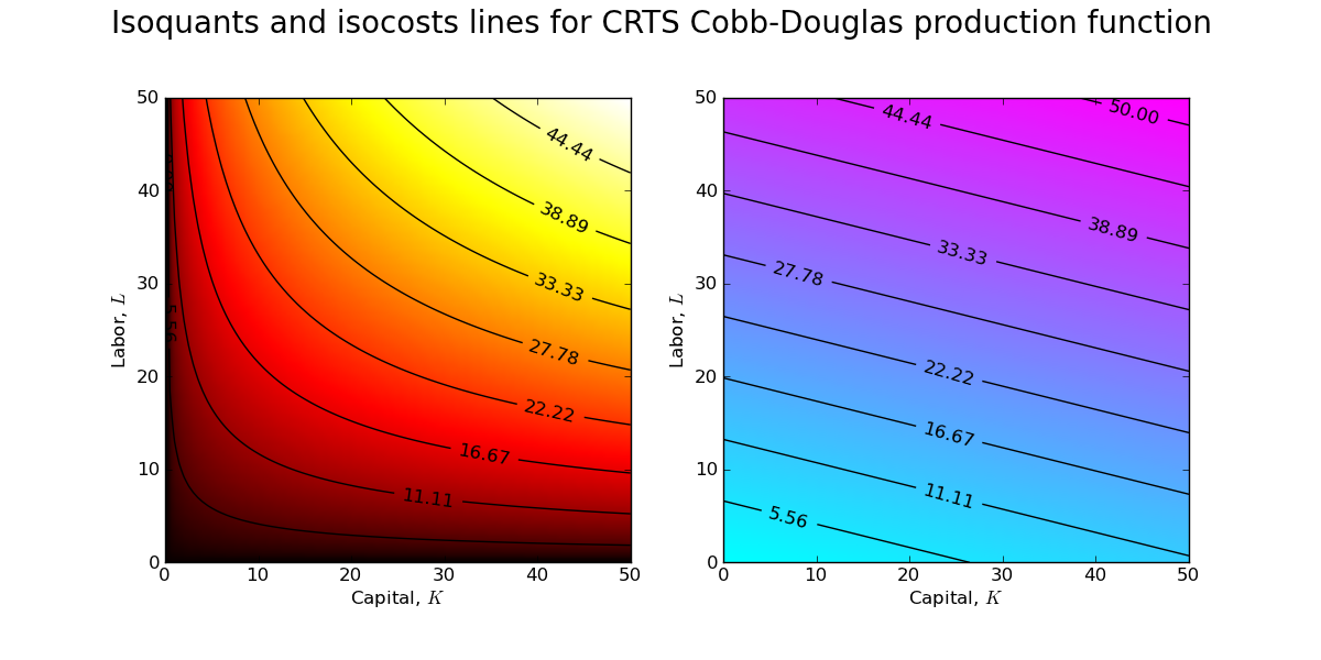
How can I create a graphic that clearly demonstrates this property of the CRTS production function? I can start by fixing values for the wage and return to capital and then creating contour plots of the production frontier and the cost surface.
The above contour plots are drawn for $w\approx0.84$ and $r\approx0.21$ (which implies an optimal capital/labor ratio of 2:1). You should recognize the contour plot for the production surface (left) from a previous post. The contour plot of the cost surface (right) is a simple plane (which is why the isocost lines are lines and not curves!). Combining the contour plots allows one to see the set of tangency points between isoquants and isocosts.
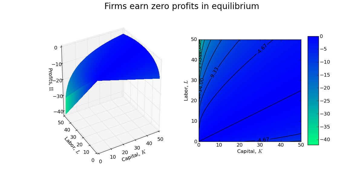
A firm manager is indifferent between each of these points of tangency, and thus the size/scale of the firm is indeterminate. Indeed, with CRTS a firm will earn zero profits at each of the tangency points in the above contour plot.
As usual, the code is available on GitHub.
Update: Installing MathJax on my blog to render mathematical equations was easy (just a quick cut and paste job).
Typically, we economists model firms as choosing demands for capital and labor in order to maximize profits while taking prices as given (i.e., unaffected by the decisions of the individual firm):\[\max_{K,L} \Pi = K^{\alpha}(AL)^{1 - \alpha} - (wL + rK)\] where the prices are $1, w, r$. Note that I am following convention in assuming that the price of the output good is the numeraire (i.e., normalized to 1) and thus the real wage, $w$, and the return to capital, $r$, are both relative prices expressed in terms of units of the output good.
The first order conditions (FOCs) of a typical firms maximization problem are \[\begin{align}\frac{\partial \Pi}{\partial K}=&0 \implies r = \alpha K^{\alpha-1}(AL)^{1 - \alpha} \label{MPK}\\
\frac{\partial \Pi}{\partial L}=&0 \implies w = (1 - \alpha) K^{\alpha}(AL)^{-\alpha}A \label{MPL}\end{align}\] Dividing $\ref{MPK}$ by $\ref{MPL}$ (and a bit of algebra) yields the following equation for the optimal capital/labor ratio: \[\frac{K}{L} = \left(\frac{\alpha}{1 - \alpha}\right)\left(\frac{w}{r}\right)\] The fact that, for a given set of prices $w$, $r$, the optimal choices of $K$ and $L$ are indeterminate (any ratio of $K$ and $L$ satisfying the above condition will do) implies that the optimal scale of the firm is also indeterminate.
How can I create a graphic that clearly demonstrates this property of the CRTS production function? I can start by fixing values for the wage and return to capital and then creating contour plots of the production frontier and the cost surface.
The above contour plots are drawn for $w\approx0.84$ and $r\approx0.21$ (which implies an optimal capital/labor ratio of 2:1). You should recognize the contour plot for the production surface (left) from a previous post. The contour plot of the cost surface (right) is a simple plane (which is why the isocost lines are lines and not curves!). Combining the contour plots allows one to see the set of tangency points between isoquants and isocosts.
A firm manager is indifferent between each of these points of tangency, and thus the size/scale of the firm is indeterminate. Indeed, with CRTS a firm will earn zero profits at each of the tangency points in the above contour plot.
As usual, the code is available on GitHub.
Update: Installing MathJax on my blog to render mathematical equations was easy (just a quick cut and paste job).
Subscribe to:
Posts (Atom)


.png)
.png)
.png)